
Maximilian Contemporary
Constructing a unified visual language across San Francisco & Mexico City
Maximilian Contemporary is a contemporary art gallery bridging the cultural landscapes of San Francisco and Mexico City. To reflect its bi-coastal footprint, the gallery required a modern identity system rooted in structural geometry, architectural grids, and high-contrast typography.
The Challenge
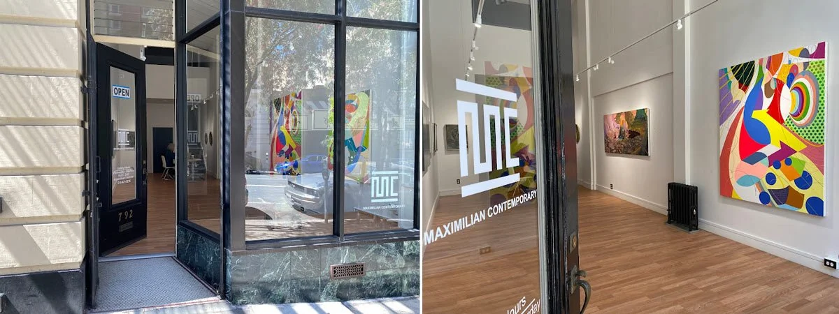
Maximilian Contemporary operates as a cultural bridge between two distinct urban landscapes: the historic, textured vibrancy of Mexico City (Roma Sur) and the refined, industrial minimalism of San Francisco (Nob Hill).
The gallery faced a three-part branding challenge:
Fragmented Identity: The brand lacked a cohesive visual language that could unify two geographically and culturally diverse locations without favoring one over the other.
Bilingual Friction: As an international institution, the gallery struggled to present information in both English and Spanish in a way that felt integrated and intentional, rather than cluttered.
Institutional vs. Artistic Voice: The existing look felt either too "corporate" (losing the artistic soul) or too "niche" (losing the institutional authority required to attract high-level global collectors)
The Concept: The Serpent’s Path
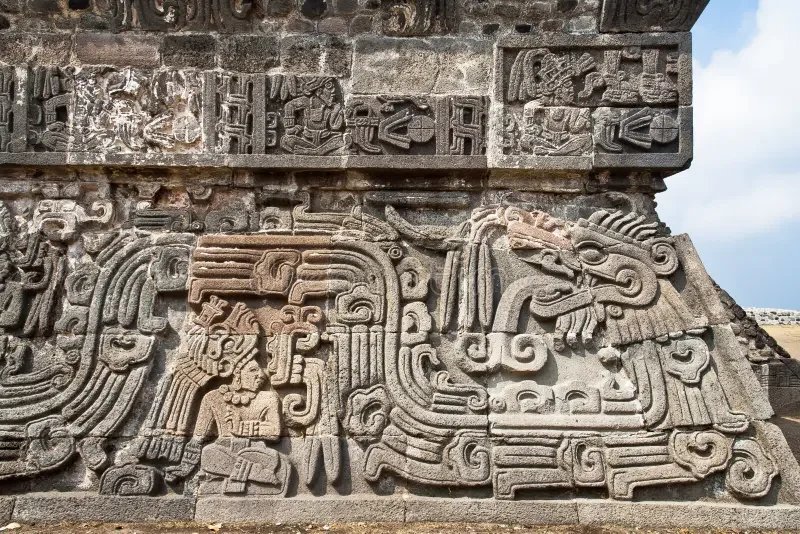
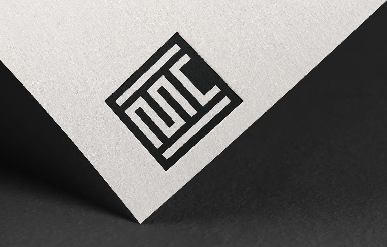
The primary mark features a custom-lettered "MC" monogram where the strokes flow in a serpentine, undulating manner. This movement is a direct reference to Pre-Hispanic Aztec (Mexica) codices and glyphs, specifically the serpent motifs representing wisdom and the fluidity of culture. This "Serpent's Path" serves as a literal and metaphorical bridge between the two cities, connecting ancient Mexican heritage with contemporary San Francisco minimalism.
The Solution
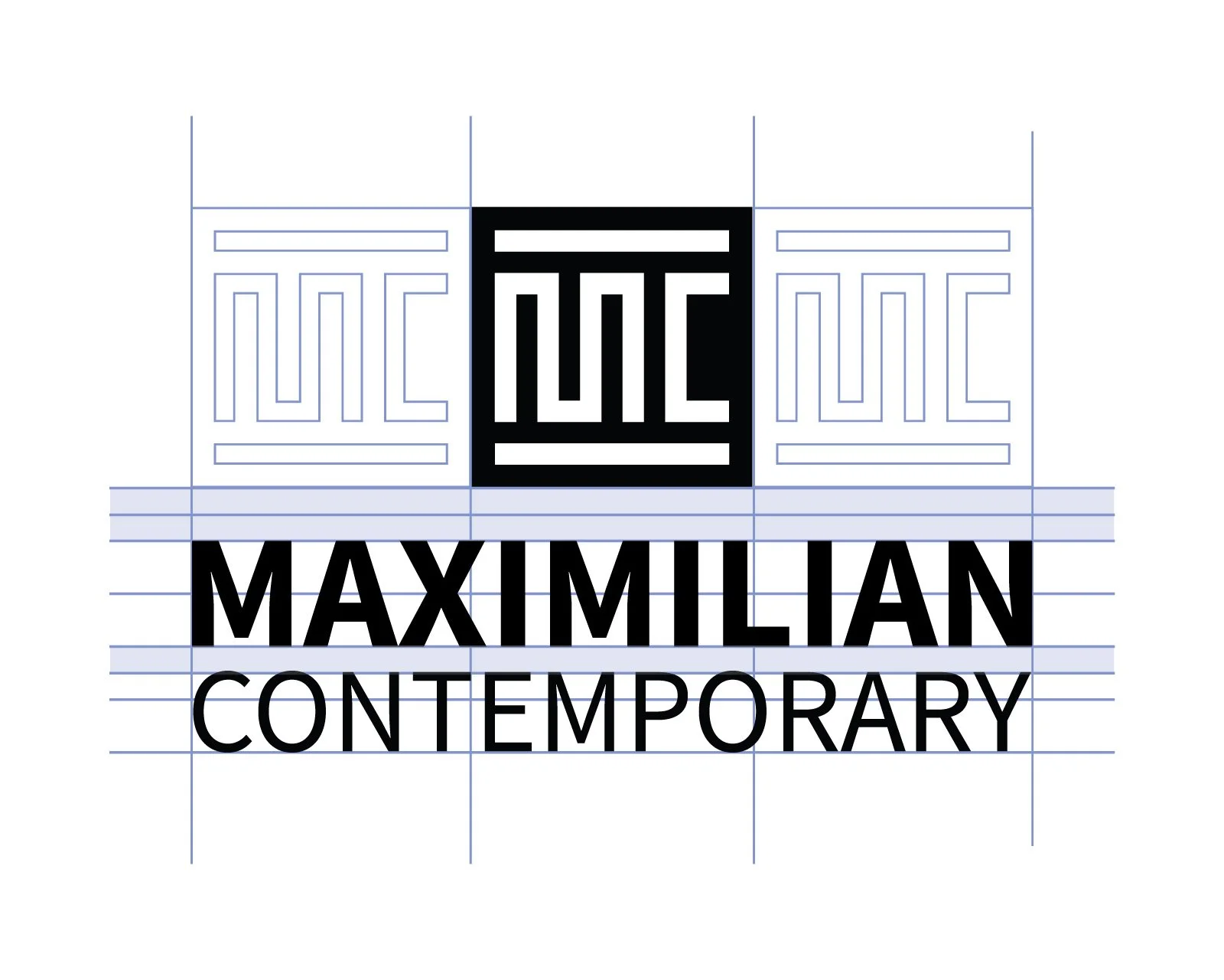
I created a sophisticated typographic-led identity that balances the industrial, tech-forward energy of San Francisco with the rich, historical architectural depth of Mexico City.
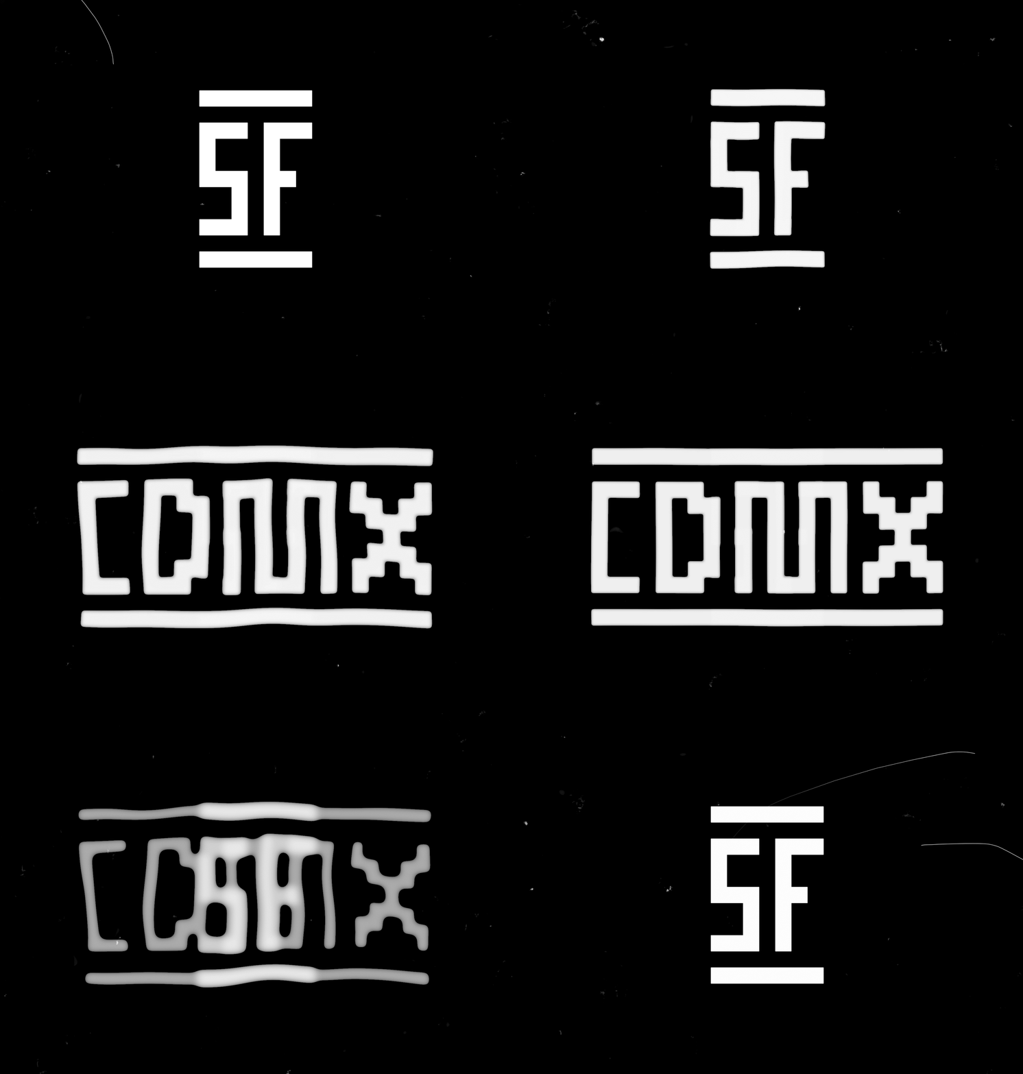
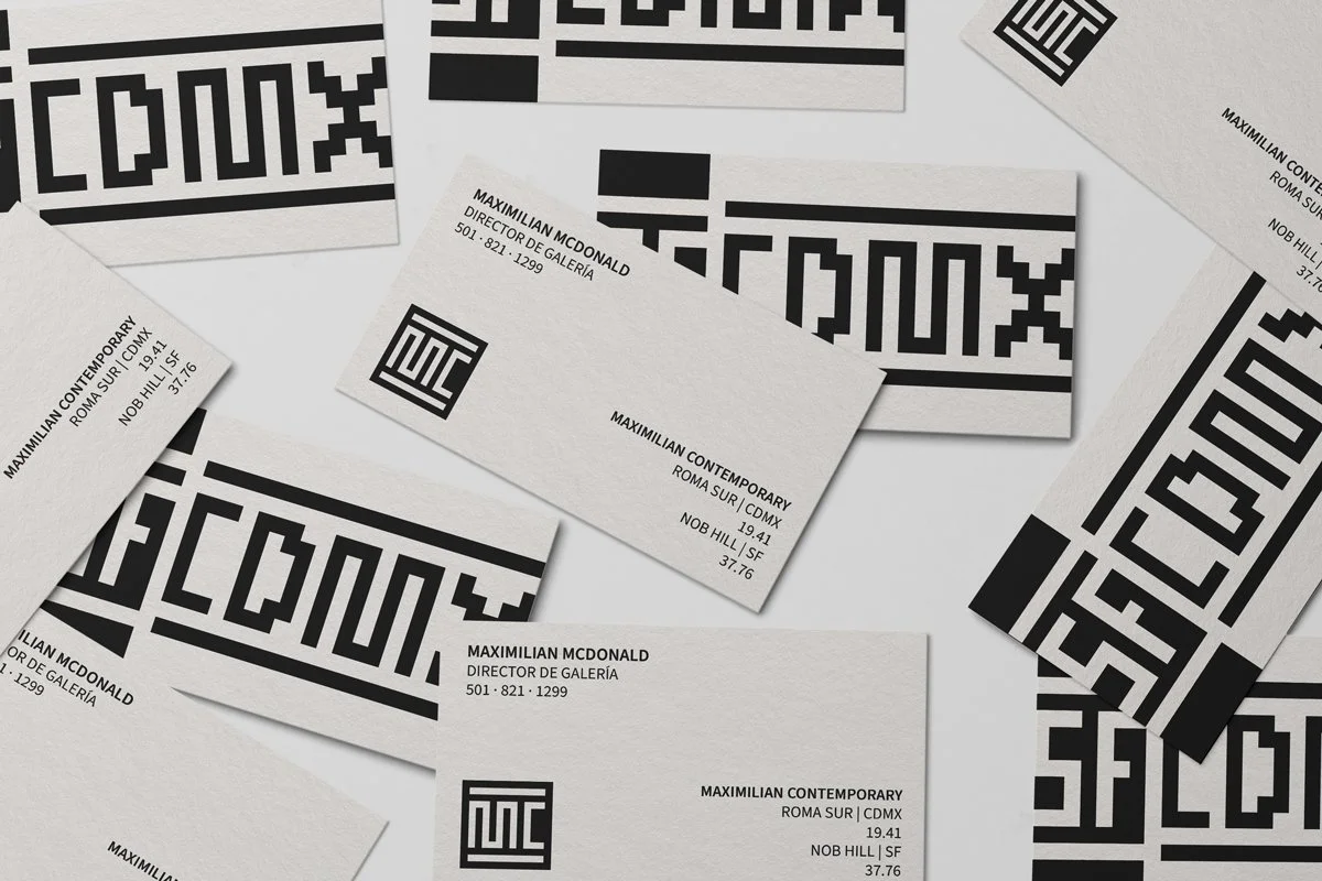
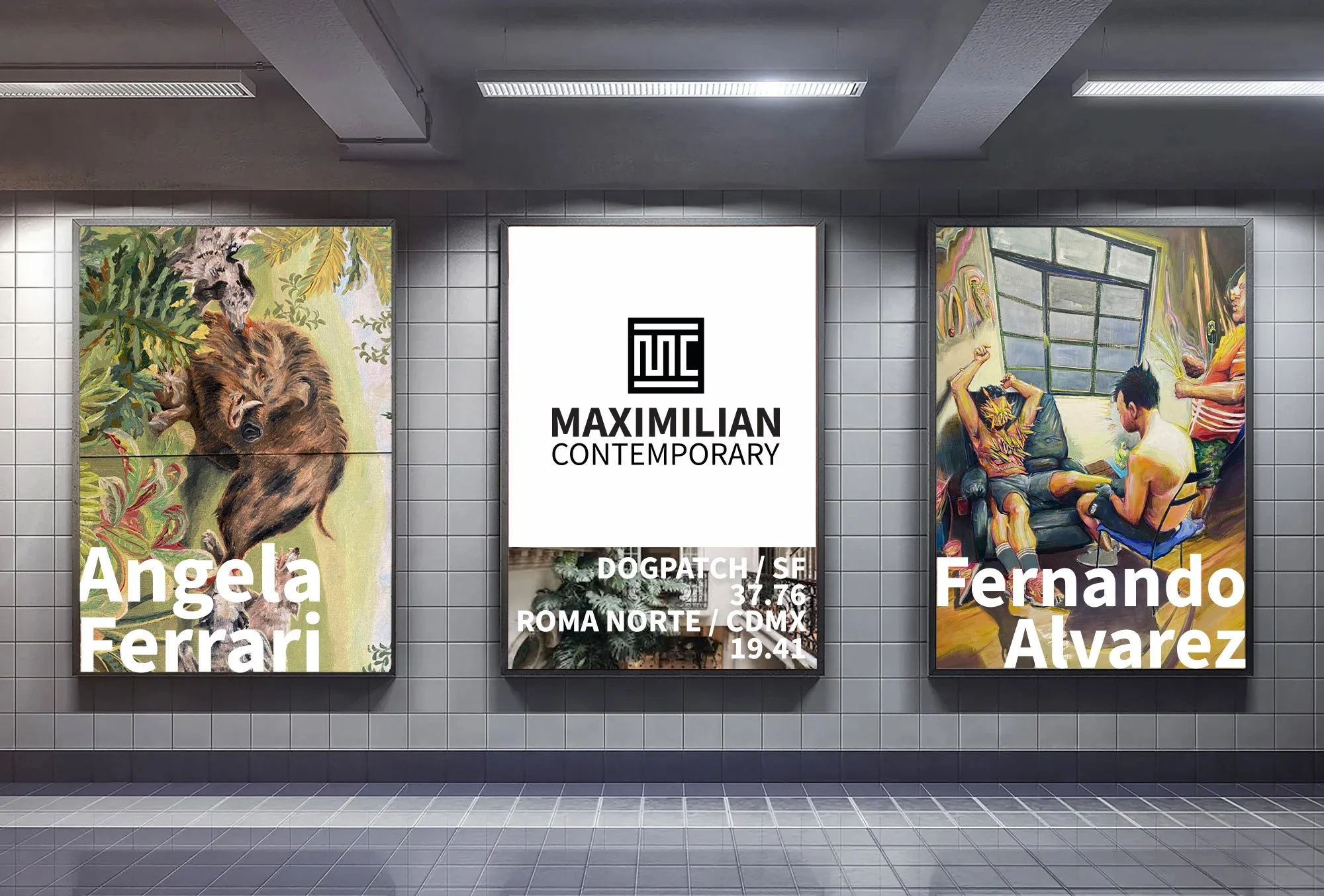
Dual-Hub Lockup: Created a condensed secondary mark (SF | CDMX) paired with precise latitude coordinates (37.76 / 19.41) to elegantly signpost both locations without linguistic clutter.
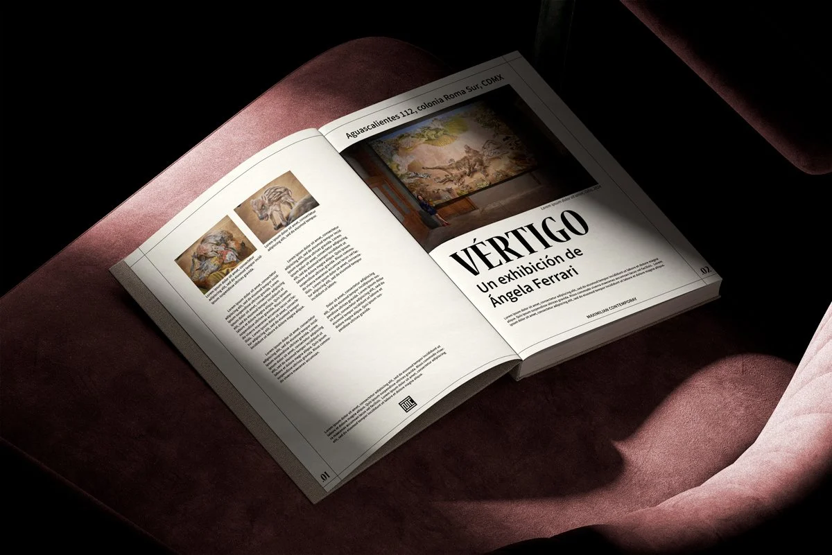
Tactile Materiality: Implemented raw, textured paper stocks and high-contrast monochrome printing for stationery and gallery catalogs, creating an elevated frame that allows featured artworks to take center stage.
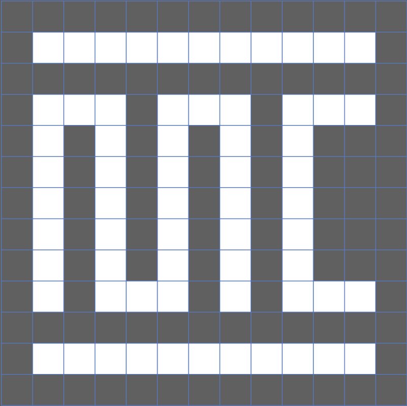
Kinetic Motion: Developed a structural logo animation system that traces the "Serpent's Path" grid stroke by stroke, bringing a modern digital presence to web headers, exhibition reveals, and digital invitations.


Project Scope
Identity System
Brand Strategy
Grid Systems
Collateral
Motion Design
Industry
Fine Art & Commercial Art Galleries
Deliverables
Master Logo & Custom Monogram
Animated Logo for social media platforms and marketing channels
SF - CDMX Animated Logo Morph
Business Card Design
Bilingual Exhibition Catalogue Guide
Digital & Print Invitation Suites
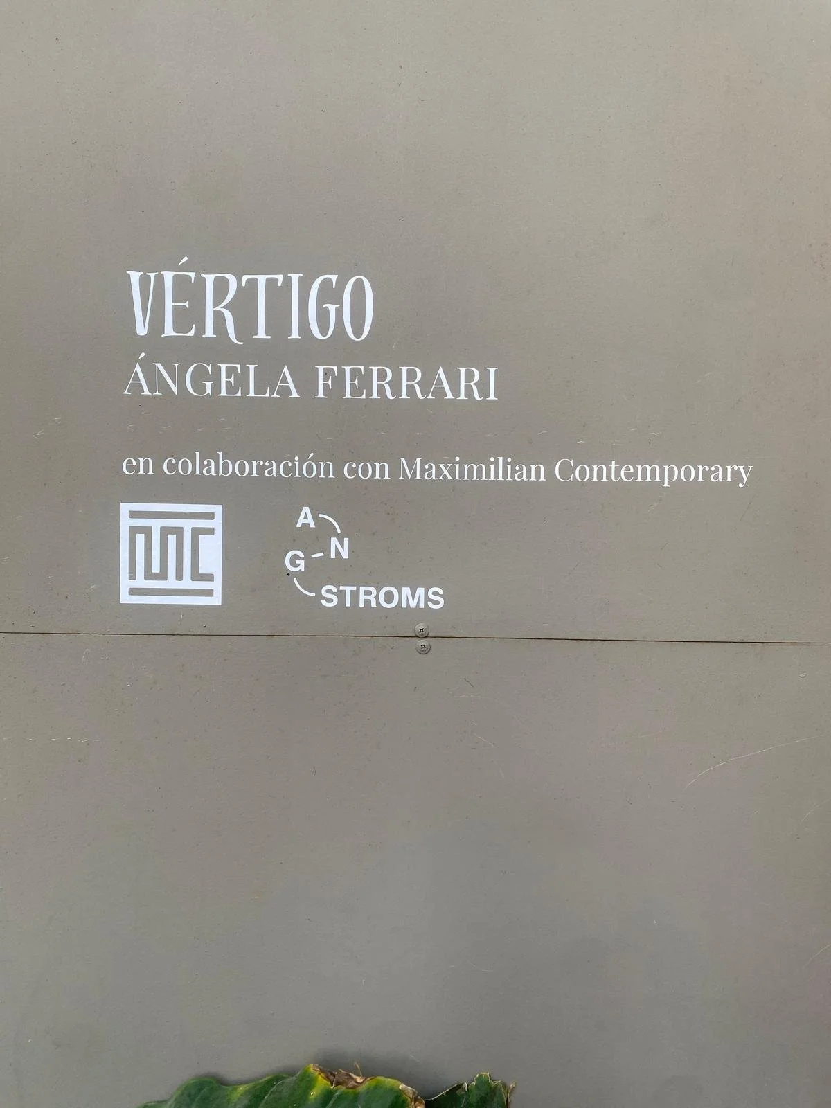
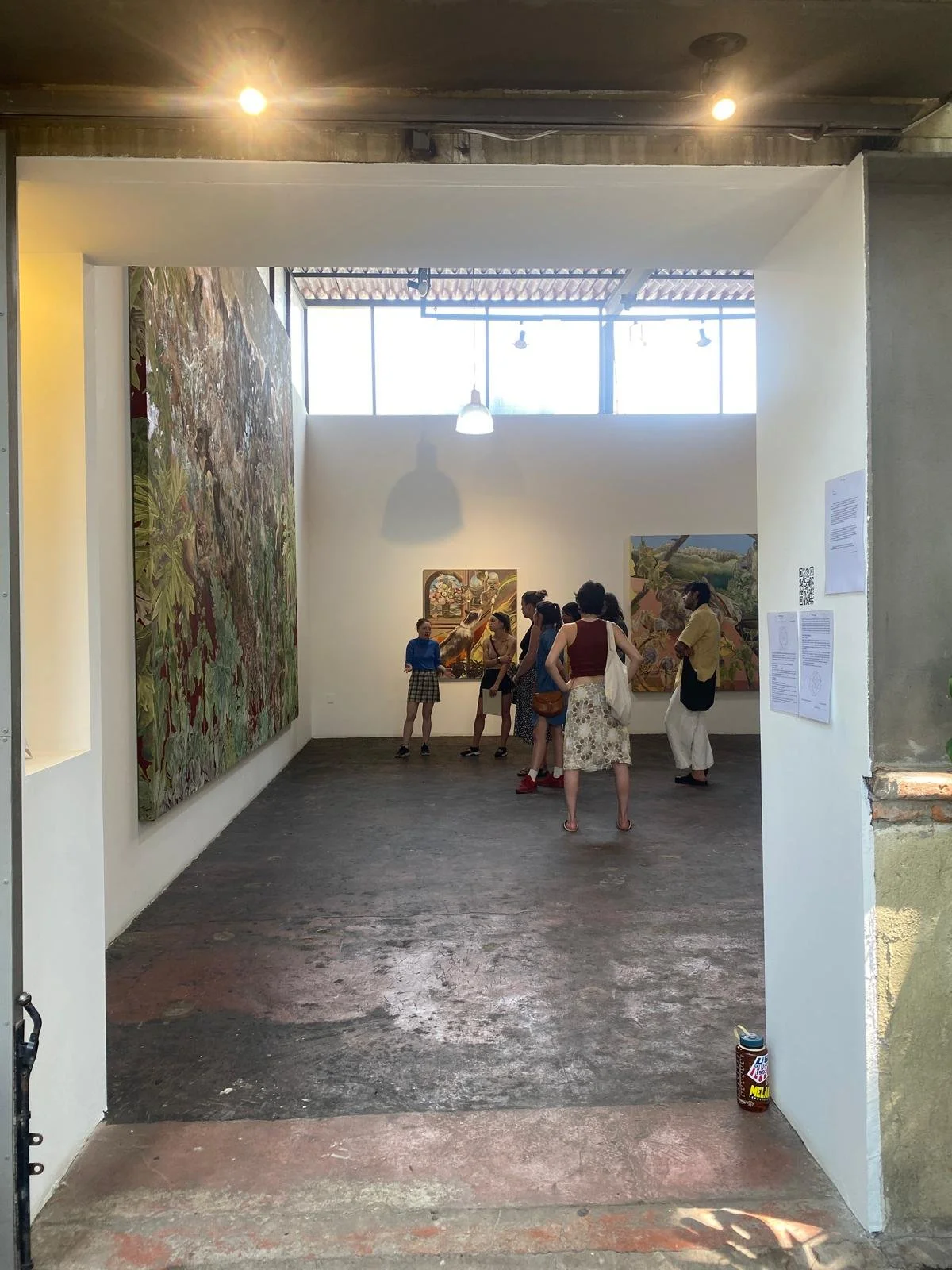
Environmental Storefront Branding (SF & CDMX)
The Toolkit
Identity: Illustrator
Motion: After Effects + Bodymovin
Visuals: Photoshop