
One More Drink
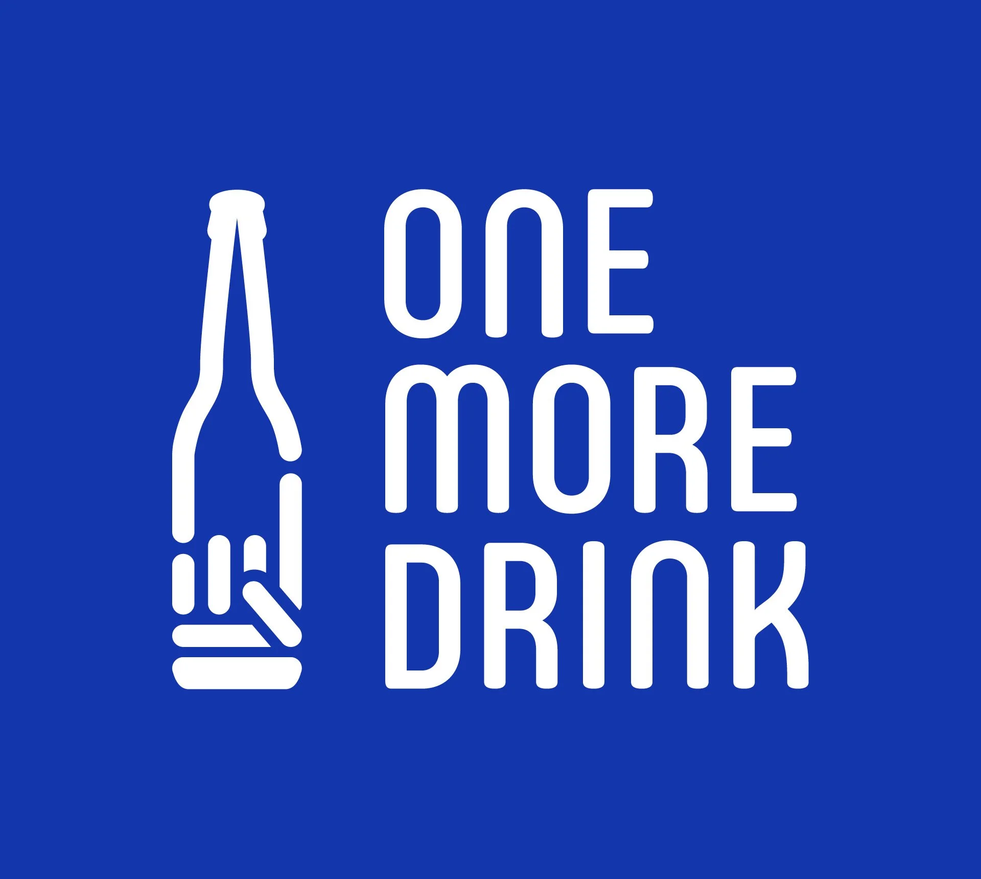
Brand Concept: The "Modern Artifact"
The objective was to create a visual identity for One More Drink that felt like a bridge between the physical history of a 100-year-old bar and the digital utility of a 2026 mobile app.
The Problem: Most nightlife apps feel "disposable"—too clean, too white, and too corporate. They lack the "grit" and "soul" of the places they represent.
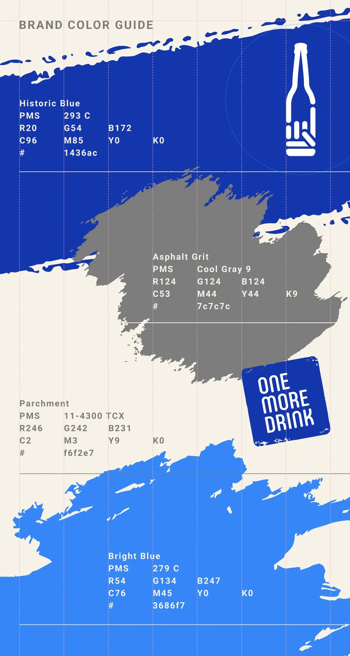
The Solution: A "Clean-Grit" aesthetic. I utilized high-contrast typography and a restricted "Historic Blue" palette to mimic the look of a physical passport.
The Narrative: The brand isn't just an app; it’s an official ledger. Every visit is an entry, and every user is a "Jefe" of their own journey.
Logo Construction: The "One-More" Mark
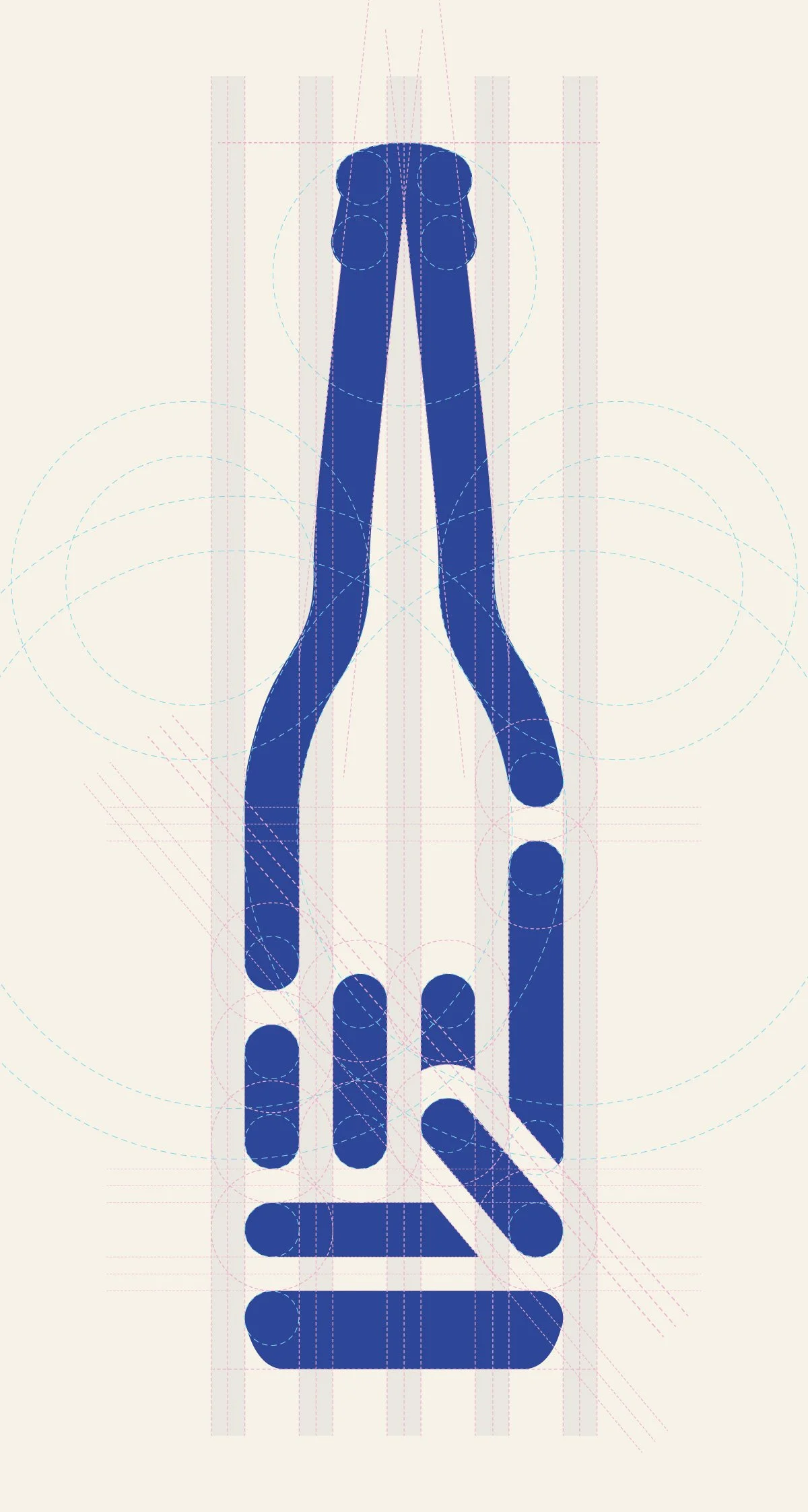
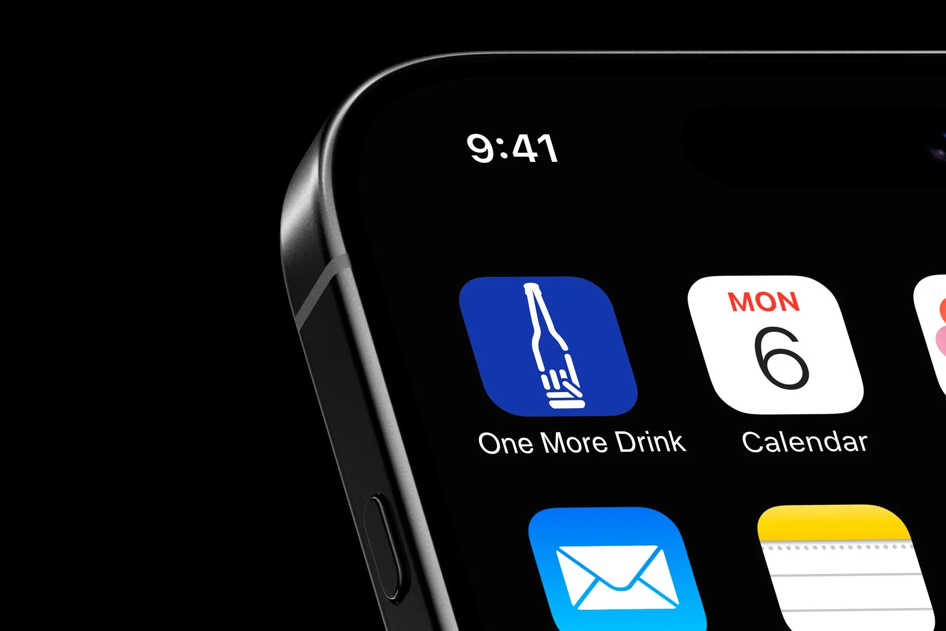
The logo needed to be a singular, iconic "Stamp" that communicated the brand's core action: ordering one more.
The Symbology
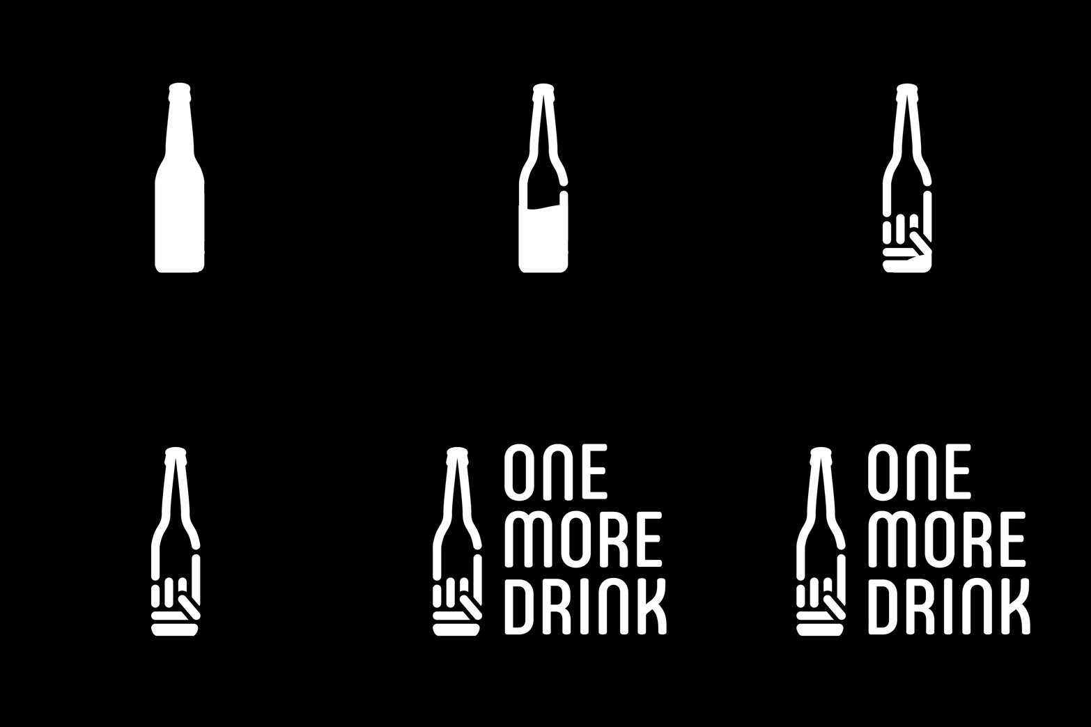
I fused two distinct silhouettes into one mark:
The Vessel: The neck and shoulders of a classic long-neck beer bottle.
The Gesture: The “one more" hand gesture, symbolizing the energy of a bar interaction.
The Engineering (The 2:3 System)
To ensure the logo could scale from a tiny 16px favicon to a large-scale mural, I developed a rigorous geometric system.
The Ratio: I established a 2:3 ratio between the Negative Space (the "light") and the Stroke Width (the "ink").
The Logic: This mathematical consistency ensures that the "gaps" never clog up at small sizes, maintaining the mark's integrity across all touchpoints.
The Toolkit
Identity: Illustrator
Motion: After Effects + Bodymovin
UX/UI: Figma
Visuals: Photoshop