Paseo Cuatro Caminos Brand Identity

The Challenge
Create a comprehensive visual identity for a major commercial center (Paseo Cuatro Caminos) that feels modern, accessible, and premium. The system needed to work across digital marketing, physical environmental signage, and corporate collateral.
The Solution
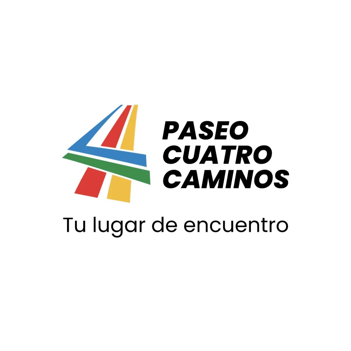
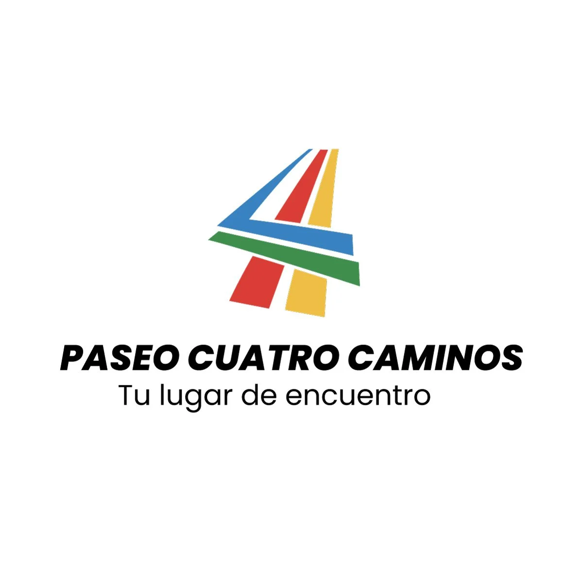
I developed a modular branding system centered around a bold numerical "4" icon that serves as a recognizable anchor for the brand.
The Concept: The icon's geometry is a literal representation of the project's name, "Cuatro Caminos" (Four Roads). The four distinct lines converge toward a central point, symbolizing the center as a regional meeting place where the community's paths intersect.
Key Features:
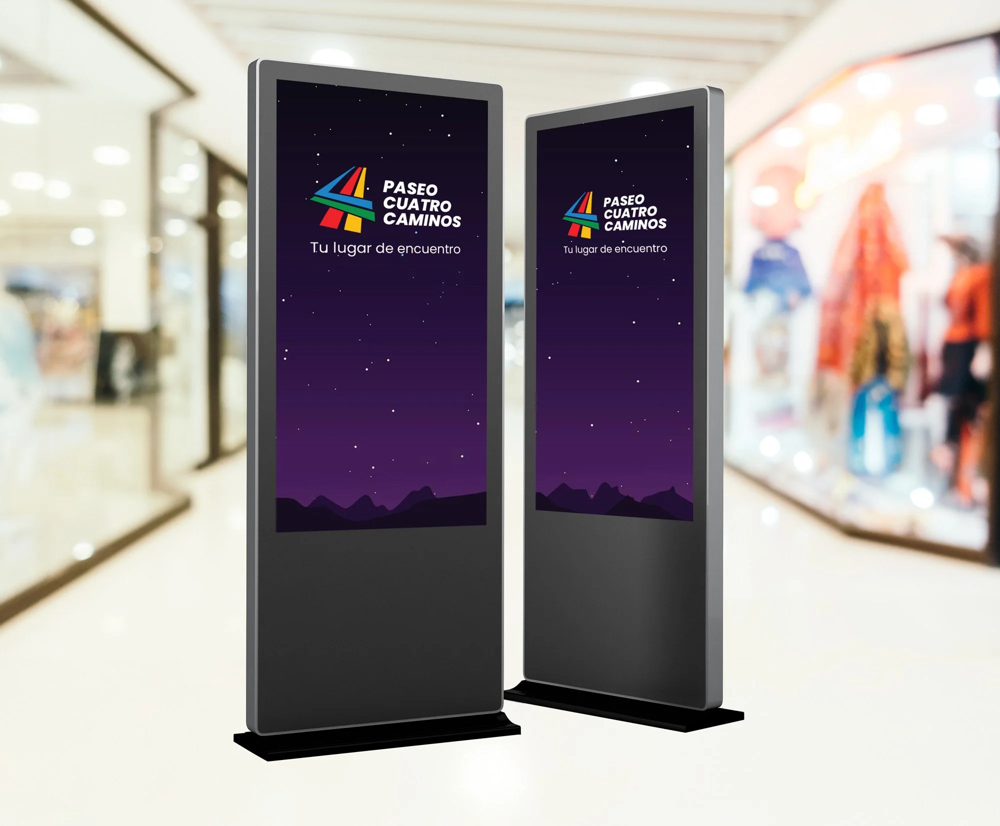
Flexible Lockups: Designed vertical and horizontal versions for diverse layout requirements (web banners vs. storefront signage).
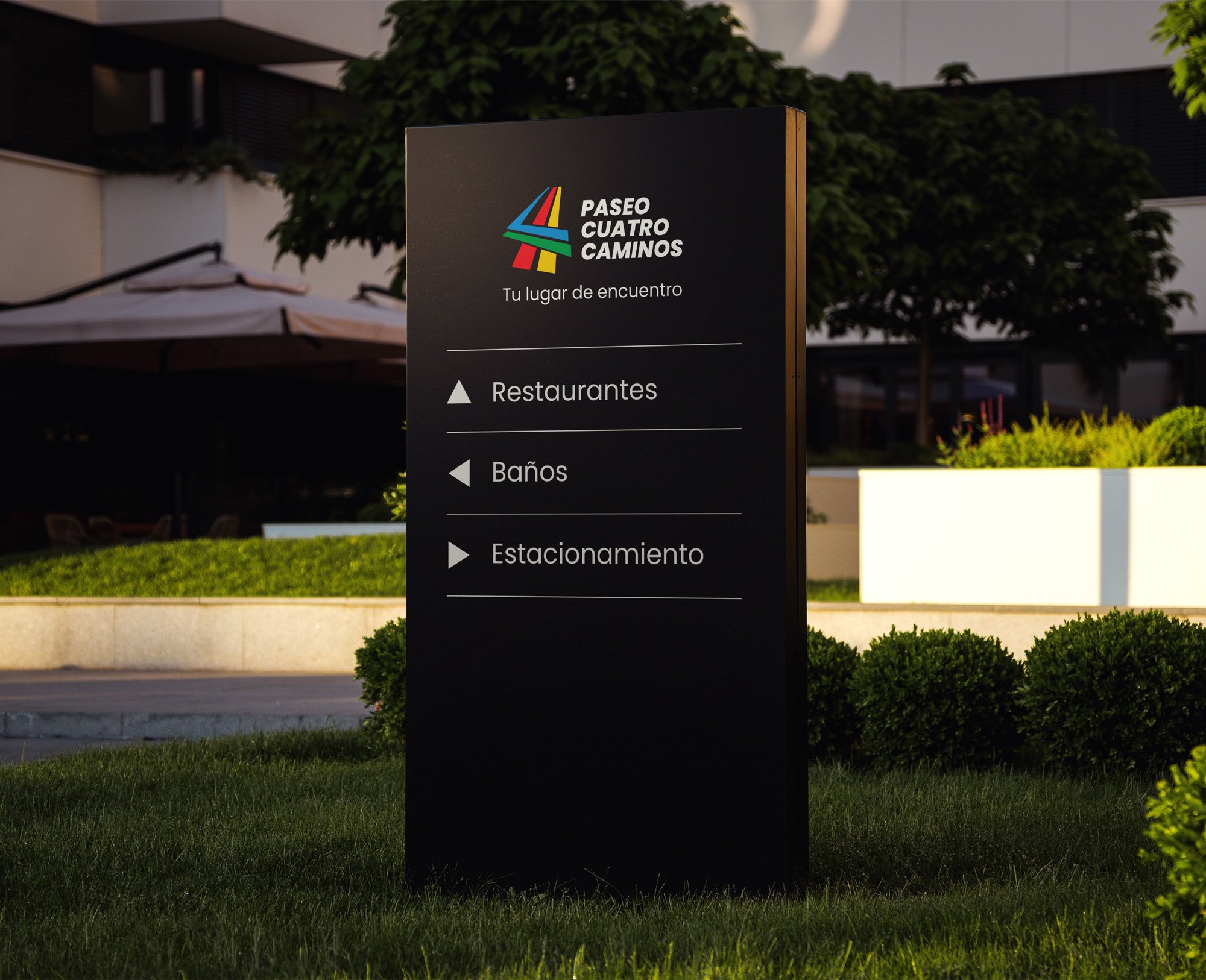
Wayfinding System: Extended the brand into the physical space with a clean, icon-based directional signage system for restaurants, restrooms, and parking.
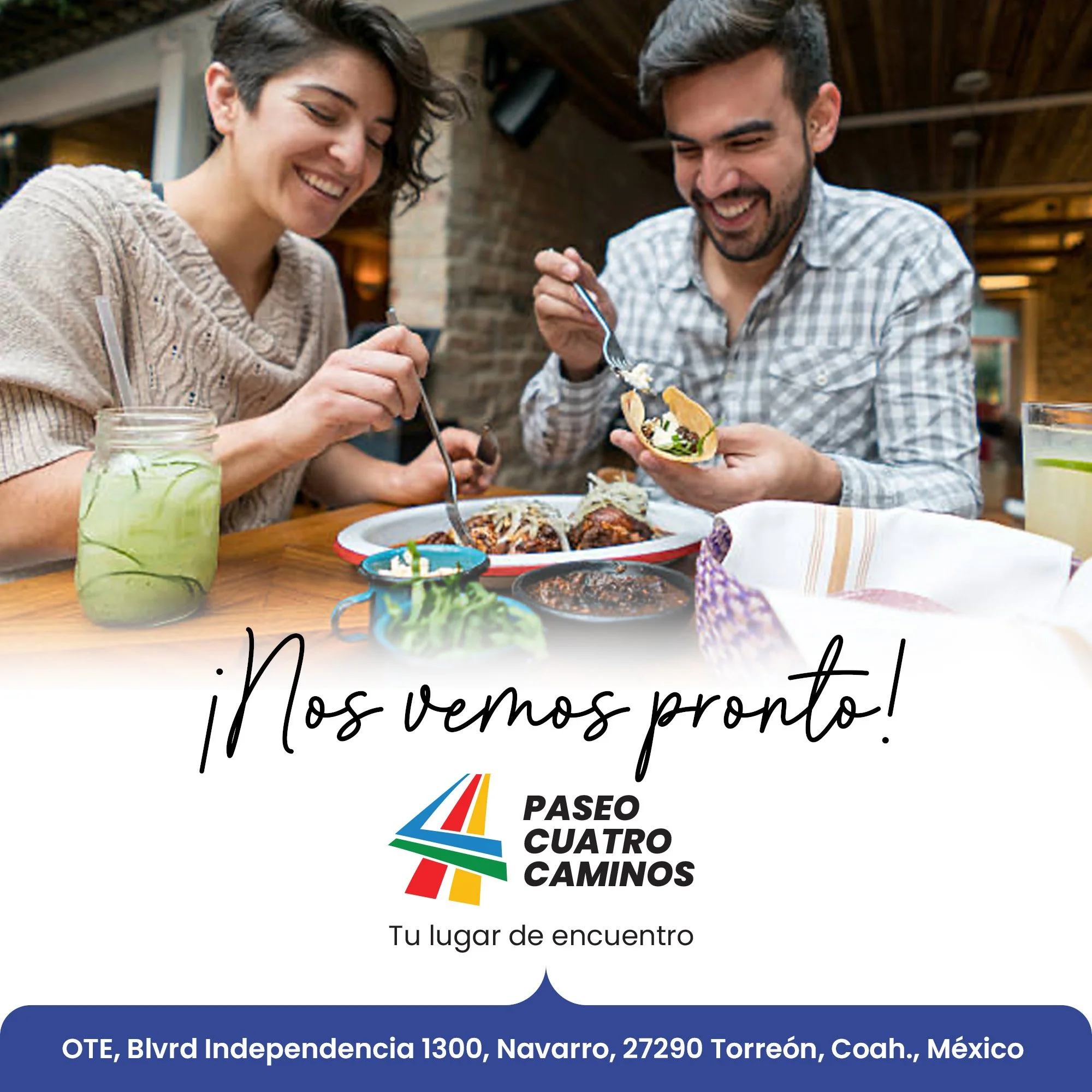
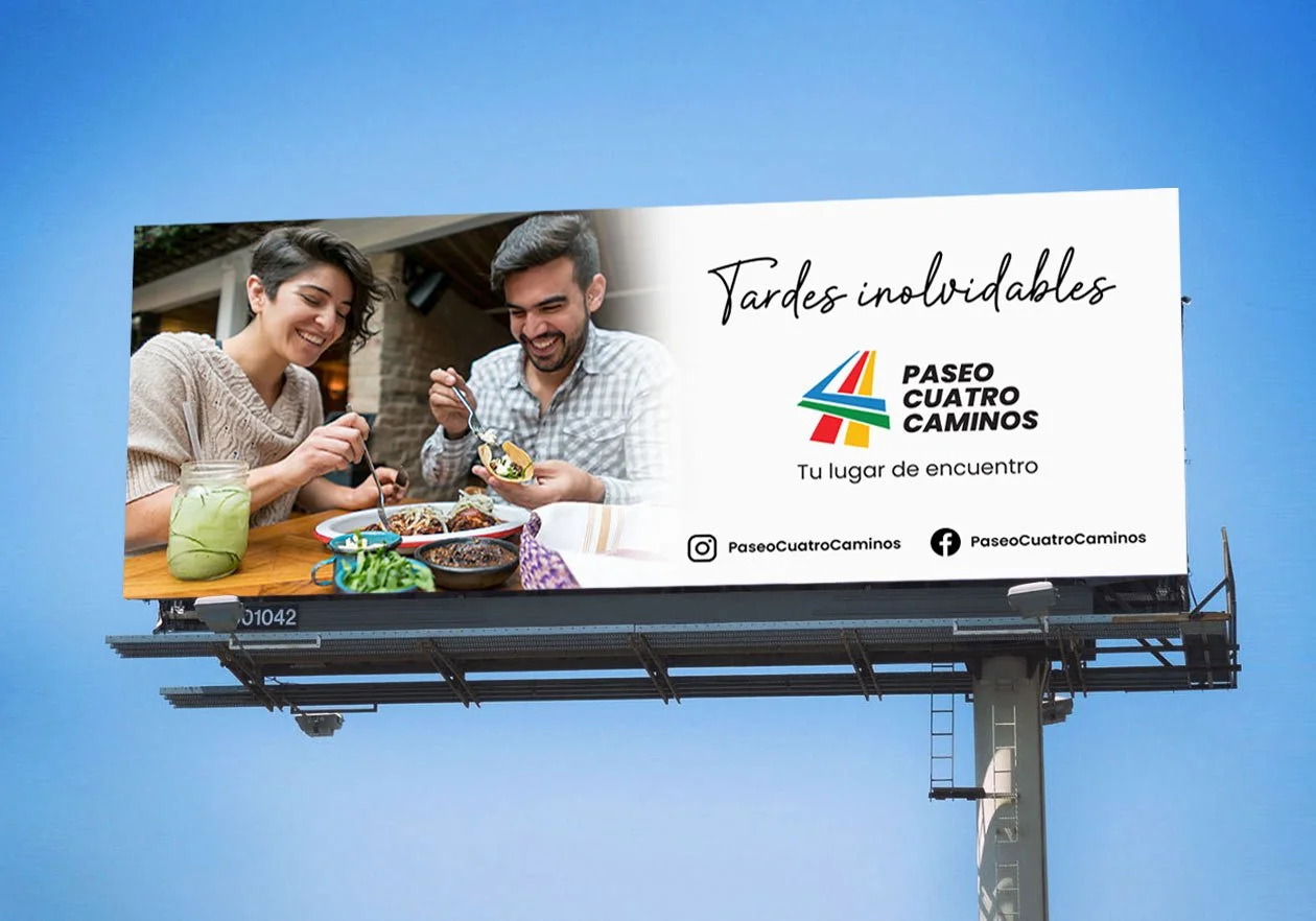
Color Strategy: A warm, sophisticated palette designed to feel "family-friendly yet premium," specifically chosen to stand out in a commercial retail environment.

Deliverables
Primary & Secondary Logo Marks
Animated Logo for Social Media and Advertising
Brand Style Guide (Color/Typography)
Environmental & Wayfinding Signage
Social Media & Print Advertising Templates