Phion (Identity Concept)
The Challenge
Develop a forward-thinking visual identity for Phion, a technology startup. The objective was to create a mark that conveys "power-on" connectivity and mathematical precision. Although this remained a conceptual pitch, the project served as a deep exploration into high-tech visual language and minimalist logo construction.
The Solution
I designed a sleek, geometric wordmark and icon that utilizes negative space and mathematical symmetry.
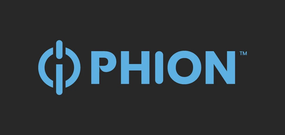
The Concept: The Power of Phi The Phion icon is a calculated synthesis of two universal symbols:
The Universal "On" Switch: Representing the activation of technology and the starting point of digital interaction.
The Phi (Φ) Symbol: Representing the Golden Ratio and the mathematical harmony found in the natural and digital worlds.
By merging these two forms, the identity communicates a brand that is both high-performance and perfectly engineered.
Key Features:
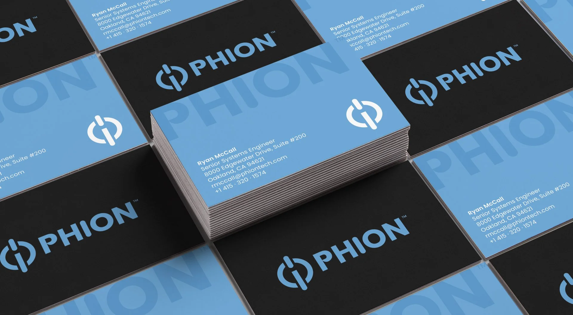
Iconic Symmetry: Engineered to work as a standalone "favicon" or app icon, ensuring brand recognition at the smallest digital scales.
Visual Precision: Strategic use of mathematical spacing and the "phi" ratio to create a sense of balance and stability, essential for building trust in the tech sector.


The Toolkit
Identity: Illustrator
Motion: After Effects + Bodymovin
UX/UI: Figma
Visuals: Photoshop, Blender + Gemini